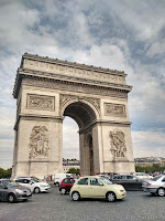
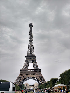
Shallow Depth of Field (wide open aperture)
Friday, December 18, 2015
Wednesday, November 25, 2015
Project 3: Balance and Contrast
Thursday, November 12, 2015
Project 3 Prework
Sunday, November 8, 2015
Project 2: Color and Grids
 |
| Monochromatic Grid |
 |
| Cool Color Grid |
 |
| Warm Color Grid |
 |
| Complementary Color Grid |
 |
| Original |
 |
| Edited |
Here are some photos that I couldn't really put into a category but I like them for ther colors.
Wednesday, November 4, 2015
Project 2 Prework
Color Wheel:
Mood:
In this photo I feel that the red sunset and the rainbow over the hills really sets a feeling of an upcoming adventure and gives off a feeling of anticipation maybe even a little bit of a relaxed and warm feeling. The photographer uses warm colors such as red-orange to give a feeling of warmth to the photo and the complementary green foliage contrasts with this red-orange and makes it stand out more. The saturation of the colors makes this contrasts even clearer.
Wednesday, October 14, 2015
Project 1 - Framing and Composition
This project was about the various ways of framing and composing a picture. The photos that I posted below are the photos that I think best represent the 8 framing and composition techniques.
I chose this picture as my best picture with a rule of thirds composition because the man that is sitting on the bench is on the right third of the picture and that other two thirds of the frame are filled by the rest of the bench, but in the original picture there was a bird on the ground, but through editing I failed to keep its presence clear in the frame. I took this picture with the middle of the bench the center of the picture, while far away. I edited this by making the whites brighter, the shadows darker, cropping the picture, adding some vignettes and I put on a light gradient that went right to left with the right with it being lighter on the right and darker on the left.
Here is my choice for a close up picture. I chose this because this picture was taken very close to the subject and in it you can see details that might not be visible when farther away. The edits I did to this picture was putting on a blue gradient going diagonally from right to left, adding a lot of vignetting, cropping the picture and adding a mask that made the background much more blurry than the foreground.
This picture best shows a frame within a frame composition. I chose this because I saw that the tree leaves looked like a frame around a picture of the building on the other side of the street. This was taken while I was walking beside tree planters and I took this with me standing back and getting the building centered between the leaves of the trees. I edited this by putting on a vignette, putting on a gradient to make the sky lighter than the bottom of the building, and I cropped the picture to make it more centered in the leafy frame of the trees.
I chose this as my best example of a bird's eye view composition because I am higher up than the subjects of the picture and I am looking downwards in the frame. I took this picture with me standing up on the little wall above the sidewalk and I pointed my camera downwards to get the "bird's eye view." I edited this picture starting with me cropping the picture, then adding a light blue gradient and adding a small amount of vignetting.
This was my choice for a bug's eye view composition because in the picture I am looking up at something very big like a bug would look up at something much larger than it. I took this photo with me lower to the ground than normal, and pointing my camera up a wall. the edits I did on this picture was: distorting the picture vertically making the wall much taller than it really is, this was reinforced by adding a light blue gradient to the top to simulate the shifting of colors to blue when looking at things near the horizon, lastly I cropped the picture.
Here is my example of a leading line composition. I chose this as my leading lines picture because the train tracks lead into the distant trees in the background. This was taken with me standing next to the train tracks and placing the camera close to the ground. I edited this by giving the image a pinkish tint, distorting the picture to make the tracks go very far into the distance and the last thing I did was highlighting the whites of the picture.
This first picture I took is my best example of a diagonals composition. The reason why I chose this is because the curb is a diagonal line that goes across the picture. I took this photo by standing a short distance away from the fire hydrant and holding my camera a little low to have the curb be diagonal in the picture. I then edited this by making it black and white with a gradient that is brighter at the top to make the curb stand out with lighting. I also made the asphalt a little more detailed and the sidewalk blurred out slightly to make the diagonal between them clearer. The last edit that I made to this picture was adding a light vignette.
I chose this picture as my best filling the frame picture because in filling the frame, you make the subject of the picture take up most of the frame. Here I fill a large portion of the frame with the side of a tree trunk. I took this picture with my camera lens pointing in between the two trees a short distance away. I then edited this by adding a small amount of vignettes at the corners, I made the picture black and white, then I added a mask to the background and made it very saturated with colors, and lastly I made it so that the closest tree trunk was more detailed than the ones on the right side of the picture.
Wednesday, September 9, 2015
The Best Thing I Did This Summer


The best thing I did this summer was when I went to France by myself for three weeks. While I was there I: went to Bordeaux to attend a training camp for fencing, stayed in a family friend's apartment in Paris, visited Saint-Emilion, stayed in their country home in Saint-Mathurin, and I watched the fireworks for the french version of the fourth of July.
A picture I took of Saint-Emilion
|
Subscribe to:
Comments (Atom)


